Thursday, March 27, 2014

AP Art Project Six- Insert Series

This piece is the third and last of my Insert Series. I like to call it "The Closure". After a lifetime chained to a person or problem. What happens when you finally no longer have that obstacle in your life? Are you relieved because you can finally start living your life for yourself or are you more crippled than you were before? I decided to go with the more eery feeling for the conclusion of the this series. I wanted my audience to decide for themselves. Although I am lifted from the burden of my past it has also left me broken and fragile. Through time I will become stronger but the constant  reminder of my past is my memory. Although you can move on from bad situations you cannot erase memories that were embedded from your brain. 
Because this is part of a series I of course wanted to continue my perfecting my pen and ink techniques. The darkness around the bodies I created by letting my pen run free and having a loose wrist.
I of course added the blue and red ink to bring the piece to another dimension. The charcoal I have started learning to use has brought my pen and inks to another level. The shading and variety of the color black has been a tremendous help with my biggest problems. 

With any project I always have my community in mind, my community is everybody. I believe I connect with every person on the planet in some way. I got the entire series from a novel I had read called She's Come Undone. Long story short, the protagonist of the story has had a hard life and ends us having a major melt down in her twenties. The novel uses counseling and psychological help to bring the woman back to life and she ends up having a great life in fact. I have always wanted to reach a greater audience, I have always wanted to help as many people as I can, be a shoulder to lean on and give others the advice they need to uplift their spirits. I created this series as a visual form of counseling and closure. I hope people look at these pieces and relate them to their own life. What is holding you back, who is controlling your happiness, what is your crutch and after you overcome your personal obstacle how do you spend the rest of your life? 

AP Art Project 5- Hundertwasser Inspired

This project was inspired by Austrian artist Friedensreich Hundertwasser. Hundertwasser's original and unruly
artistic vision expressed itself in pictorial art, environmentalismphilosophy, and design of facadespostage stampsflags, and clothing. The common themes in his work utilised bright colors, organic forms, a reconciliation of humans with nature, and a strong individualism, rejecting straight lines. The one thing I most admire about this Austrian artist is his control of color. He focuses one area on one color. Although they each color is blocked off, they all collaborate and work well together. 
 

Because Hundertwasser's work is the complete opposite of geometric, I decided to take a risk and incorporate his use of color with geometric shapes. My teacher was shocked that I had not mimicked Hundertwasser style for style like my other classmates. I am glad I combined geometric with free-flow and the contrast worked well together. I felt that the risk I took was for the best. Although people are aware that this is Hundertwasser inspired, it is as always a Morgan Haney Original. 

Throughout his work architecture is always featured. I decided to not make that the focus of my piece but rather just a component. I was not sure I would find the perfect between Hundertwasser and myself. My sketch is very different from my final piece and there was a lot of playing around with different formats and places. I love my final piece, it is a wallpaper (Morgan style, Hundertwasser color influenced) with window views of Hundertwasser represented architecture. I am happy I collaborated myself with Hundertwasser. With al my projects I always want to be represented. 

Tuesday, March 25, 2014

AP Art Project 4- Look Past the Blinding Light

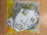
This piece had several challenges made from tedious mistakes from myself. An hour earlier in the day I had been using oil paints for another project and had wet paint on my arms and hands. For anyone that is familiar with oil paints knows they are very slow to dry. Long story short, the oil paint smudged green paint on my yellow drawing. I went ahead and added yellow and orange into the face to draw attention away from the smudges. Sad to say, my oil paint fiascos did not end there. I went ahead and assumed the yellow paint I had picked up to use was indeed watercolor, which is what I planned to use. The paint was not lying down on my watercolor paper smooth but rather rough and clumpy. Come to find out, I had in fact used oil paint for my water color! Totally bummed, I solved my problem by trying the water color pencils for the first time. They allowed me to add yellow color exactly where I needed. These obstacles taught me to pay close to my surroundings and what I use and to definitely clean up after myself!
I was getting pretty good at using a black pen to my advantage. Drawing human hair has always been a struggle for me, luckily, my own hair has so dimensions. All the curls, and twists were fun to draw and I am happiest coloring/ drawing out side the straight line. I used a variety of pen widths; thick for my  basic outlines and thin for inside details. I ended up creating a swirl effect around the parts I wanted shaded instead of just simply shading it in. For my hand, I used the technique of contour lines and followed the curves on my fingers. I used spacing to represent my various shades. 


There is a total contrast when I place the photo I took next to the water color I painted. The two pieces give me a two different feelings. The top photo makes it seem as though I am looking at something like an insect on the ground, as opposed to the bottom which gives me a sense I was looking through something. 
After much reflection, I realized this is what I envision myself looking like when I see the face of God. He is the yellow paint, the blinding light I can't help but stare at. He sees through Me, not the other way around, With his light, he pours himself right into me, washing away all impurities I had aquired from being on Earth,. After analyzing this project, it has reassured me to live my life through God, he is my keeper and when I finally do reach him, all my sins will be swept away.

AP Art Project Two-My Own Head

This project was the first time I had ever used prisma colored pencils. In class, we had an assignment to draw a still life of the apple. Although the apple was red, I used purple and yellow for my highlights. The prismas have so many options to choose from. The colors are vibrant and amazing for layering. I knew I wanted to use prismas to bring a piece to life. After this prisma project, my eye for color was stronger. 

This photograph is actually a scanned photo I took using my home printer. This process is called scanography. which is the process of capturing digitized images of objects for the purpose of creating printable art using a flatbed "photo" scanner. I added my dove necklace and blew my breath on the screen to show condensation. 

I took this photo in Art Three which was my junior year. 11th grade was not the best time for me. I was stressed from my school work, friends and family. The black space around the picture I envisioned was my own head, I felt I couldn't escape my own head. I began to envy the birds I would see around me. Their ability to pick up and leave any spot they were at. No ties forcing to return to places that may have caused them problems in their past. I believe birds are my spirit animal and I most identify with them. After completing this photo in prismacolor my senior year, this photo has a new meaning to me, I am glad to have overcome my trials and tribulations that once hindered me from being happy. Instead of envying birds, I now admire them. 

AP Art Project One- Insert Series

 Through each piece of art I make, my personal choice, interest or expression is always present. One of my favorite mediums to use is a basic black pen. Stippling is my most common technique but after playing around on a few sketchbooks I created my own little version of pen stroke. Dragging, shooting and letting my pen run freely on my paper gave me very unique gesture drawings. the human body is so beautiful and it is my favorite object to gesture draw. Adding red ink and charcoal were new things I tried out on this piece which I am glad I did. The second and third mediums add an extra dimension and also depth to my figures.
I took a risk with this pen and ink by not specifying the gender of my bodies. By not including hair, certain boy parts or even facial features, I let my audience define and insert their own genders. One thing I struggle with is gender. I absolutely hate identifying my bodies by gender and actually find I am limiting my audience. I want my art to speak to every one, Every race, every age, every background and ofcourse every gender. I feel people underestimate how alike other people are to them. I know I have something in common with every single person on planet and Earth and I believe this piece definitely represents that. 

My personal story to this piece is that the two figures are both me. I titled this the Insert Series  because I want people to make this work personal. For me, I constantly am relying and reverting to my innocence. The adolescent me is often stressed, frustrated and scared about how fast my world is turning and constantly changing. I always wish to go back to being a little girl. What was my biggest worry? I doubt I even had one, playing on a playground, drinking out of a curly straw and laying in my parents' arms when struggles arose. This work examines how much I miss when life was simpler, before I was exposed to the evil of the world. 

Thursday, January 2, 2014

Art IV Honors, Projects 8&9

The drawing class was using charcoal and I thought it would be a great medium for my eighth piece. Thinking it would be easy to shade and show contrast, I decided on buildings. Why I thought charcoal would be easy, I have no idea. It was constantly smudging and after each day of work, the charcoal was always leaving the paper. The buildings I drew were based off the Brazilian slums. I titled this piece A Conflict of Interest. How one city can go from drab and dreary to big and promising. 
Aside from watercolor, paint is not a first choice. Our teacher made oil painting a requirement and I had no choice but to comply. I had initially picked a sketch I had drawn out but with feedback I went with a portrait I had taken of myself. (A selfie basically.) I was told blending skin color would be easy, and it was. 
I chose warm colors to portray the intense heat I feel from critisicism. Since the beginning of time I have yearned for a place or a feeling of acceptence. In the painting, my eyes represent me finding what I was looking for. I titled this picture Home, because my search is now over. 


Wednesday, December 4, 2013

Art IV, Project 6&7

I started getting more into my concentration and decided my focus would be on myself. Mental disorders always interested me, people can't see what's on the inside. This piece was a focus on the difference from being busy to overwhelmed. This line is thin and easily crossed for people like myself. Feeling overwhelmed with day to day life, not having time to do what you need to is exhausting. Some days I wish my head would stop spinning and I feel like cutting it off. I express my relief through the color change of purple and red. How relieved I would feel if my stopped feeling overwhelmed. 

Why didn't anyone tell me collages would be tricky? Especially one so large. I started flipping through National Geographic magazines and started pulling out landscapes that I used for my background. I had no idea what my focus would be. I started finding pictures of people looking from different view points and arranged them by perspective. This was a multi-media piece using acrylic paint, tissue paper and magazine clippings.

Friday, October 25, 2013

Project Five, Art IV

One of my required mediums to use was paper sculpture. I was excited and nervous about doing something 3D. I thought about doing an animal but felt that would be too difficult to accomplish in three weeks. I decided on a tree because although the shapes were simple, there was so much depth I could add to them. 
I knew I was using white paper but still wanted to bring color to my piece. I thought adding colorful message slips. 
This project  took up so much of my time. I placed the man at the trunk of the tree hiding and slouched to express gloom in the midst of something so beautiful. 
With different angles of my tree in some you can see the man slouched and in other angles you cannot see him at all. I decided to title this Somebody's Christmas because even on such a beautiful day like Decemeber 25th, there's no telling who might not be enjoying that day and why. 

Tuesday, October 8, 2013

Project Three, Art IV

My inspiration from my third work comes from a class mate. I like the patterns tye dye makes, because it's not repetition at all. It's more of a different shapes repeated in random places. 
I wanted to recreate this tye dye image onto paper with watercolor. Blue was definately the color I wanted to go but India Ink was something I picked up. I started randomly blowing on this small sheet and realized they had turned into trees. 
I tried to recreate what I had done on the practice sheet onto my final. The blues on my final were so intense and the shots of yellow were perfect. 
My teacher felt this piece was incomplete and I agreed. I needed something for this forest, to bring it to life. For weeks I couldn't decide on what should be apart of my blue-green forest. My deadline was approaching fast and I still hadn't thought of anything. I was I desperate need of life. I had suddenly found it! I added yellow to highlight them, I didn't need to add life to piece because it was already there. I couldn't believe I was searching for things to pile upon my forest but the life was already there. My forest had lungs! It was already breathing. 
I titled this The Living Forest, for obvious reasons. 

Project Number Four, Art IV


I love my hair, there, I said it. I love painting and drawing and showing the texture of it. My curls have definition and tons of depth and I felt acrylic paint would be a great tool to express that. 
I immediately knew I did not want to just use a canvas for this piece. A few if my peers were working with cardboard and I loved the idea of the it's texture coming through the piece. But I felt I could take that idea a step further...
I was excited to use the wood but it was also driving me up a wall. No matter how much paint I used, the wood would just soak it up. I admit to not working so neatly but I also prefer not to jut slab globs of paint onto a project. It took over two weeks til the colors finally starte working together and were made bold... 
I am not that into realistic drawing nor am I great at it. Although I painted all three bodies from the same photograph I interpreted them in three very different ways. No nose the same, nor the brush strokes on each collard shirt. I wanted the colors I chose to reflect that as well. Who has orange skin and purple hair? Who do you know with deep black piercing eyes? I decided to title this Surfaces. 

Sunday, September 22, 2013

First Two Projects, Art IV Honors

I took our first assignment very seriously.  My theme for this project was A Moment in Time and  my topic was Movement. 
I was a liitle rusty from being inactive over the summer and wanted to showcase my best talent: pen and ink. I used several techniques to separate the trees, from the raven, from the sky, book and glass jar. 
Stippling, hatching, cross hatching and a few techniques that I made up helped blend and create variation. 


I felt like my first work wasn't personal. What's more personal than creating something around yourself? My younger brother took this photo of me in my garage. My original idea was to do a simple pen & ink. But water color soon invaded its way in...
I really liked my piece in black and white but people kept telling me it was 'incomplete'. They were right although I had put myself at the center of the piece I was still blending in. I wanted to pop...
I brought some color to my work, to me. I chose the brightest colors too, yellow orange and red. I love how vibrant I look. Looking at this five feet away I am the only thing that stands out. 

Wednesday, January 16, 2013

Art Three Assignments


Three Color Print
Title: Morgan Neon Fiasco
Medium: Water Soluble Printing
This particular print was the same image repeated multiple times.

 Bust
Medium: White Clay, Acrylic Paint, Magazine Paper and Medium
My bust got a couple cracks after firing, I decided to layer shades of brown and black paper clippings and covered the entire bust in orange medium for unity.

 Double I.D. Painting
Title: Cold Dust Girl
Medium: Acrylic Paint, Medium
A finger painted self portrait from a photo.

 Scanography
Title: Nighttiming
Medium: Computer Printer Ink
A piece of artwork created from my own personal computer and scanner.

Photoshopped Letter
No title
Medium: Colored Pencil
A letter drawn free hand which was then altered in Photoshop.

 Scratchboard
Title: Tied Up
Medium: Scratchboard
A piece created from a photograph taken before hand.

 
Gesture Drawings
No title
Medium: Watercolor, black pen
Each drawing from different models, posing live.


Museum Shadow/ Light Drawing
No title
Medium: Pencil
Drawings done from sculpuures in the North Carolina Museum of Art.


Resolution Photography with Filter
Title: What They Made Us
Medium: Photography
A photo which had been altered in Photoshop with a filter.


Scratch Board Filter
Title: Red Tied Up
Medium: Photoshop
My scartchboard, which I altered in Photoshop with a filter.


Three Color Print
Title: Morgan Fiasco
Medium: Water Soluble Printing


Friday, September 28, 2012

Art in Writing

Dogmatic

Material: watercolor, pastel


Morgan has drawn ten words on her paper with pastel, but only one is boldly printed in deep red; Dogmatic. Dogmatic is a descriptive word and a synonym for arrogant, emphatic or stubborn. Her jotty watercolored lines represent how staright-forward and assertive she can be. Morgan's favorite quote from the band Two Door Cinema Club is the background to her piece and words she lives by. "The critics talk of stubborness but you're just passionate.", is the phrase she uses to explain, or rather justify her dogmatism.